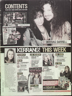
Contents Page Analysis

This contents page has many of the qualities and conventions demonstrated by most Kerrang contents pages. The main article that the editor feels would appeal to the most to readers is given a full half a page. The background of the rest of the contents is predominantly white. This makes the black and yellow writing stand out more and makes the page more attractive to the eye. The title ‘Contents’ is in big clear letters and is in a light colour making it stand out from the black background it is pinned against. As well as this title the banner stating ‘Kerrang! This week’ is used to headline the rest of the magazine and what is contains. The word ‘Kerrang’ is in white letters as appose to the words ‘This week’ which are in yellow. This is so that the title of the magazine stands out more than the works ‘this week’ against the black banner background. There is a slight editors section which I may or may not put in my contents page. The sections of the magazine are clear shown by the big yellow writing and the black background to make them stand out. The pictures are placed very specifically with some even coming out of their frame. The page numbers and article names have a bigger font than the additional information so that the reader can choose to read the additional information if he or she wanted to. This means the reader doesn’t have to look far to find the article names.
No comments:
Post a Comment