Monday, 28 March 2011

Initial Sketches: Double-Page Spread

Being as I was ill for a large proportion of this week, my initial sketches did not get completed, however, I was able to come up with a list of what I wanted on my double-page spread. This list told me what my double-page spread should look like and the design it would have. Here is that list:

  • Big main image in the middle of Holly as Jessie J with swallow tattoos showing.
  • Two columns of texts either side of the main image.
  • Huge caption in the top left with a slightly transparent black rectangle behind it to make the caption more readable.
  • Blue big text for the questions being asked.
  • White smaller text for the answers being given.
  • Pose of Holly looking away from the camera with a cigarette in her right hand.
  • Page number in white writing with black background box as on the contents page.
  • Background colour of columns will be light purple.

Initial Sketches: Contents Page

Being as I was ill for a large proportion of this week, my initial sketches did not get completed, however, I was able to come up with a list of what I wanted on my contents page. This list told me what my contents page should look like and the design it would have. Here is that list:

  • Grey, simple background.
  • Numbers and works ‘this week’ in white writing and black background to match the title of the magazine.
  • Yellow writing for articles.
  • Picture of Holly as Jessie J as main image, picture of Sarah and Becky as Hayley Williams and Lily Allen as slightly smaller image. Finally, picture of Matt and Euan in the bottom left as the band ‘Architects’.
  • Word ‘Contents’ in big red letters.
  • Quote under the word ‘Contents’ in black small writing with the name of the person who said the quote underneath in bold.
  • Very simplistic overall contents page.

Initial Sketches: Front Cover

Being as I was ill for a large proportion of this week, my initial sketches did not get completed, however, I was able to come up with a list of what I wanted on my front cover. This list told me what my front cover should look like and the design it would have. Here is that list:

  • Strap line banner across top and bottom.
  • White writing for title with black background.
  • Image of Holly on the front cover with her swallow tattoos showing.
  • Other pictures of bands and band members quite low on the page.
  • Big black and white title across main images saying ‘Jessie J’
  • Bar code in bottom right hand corner.
  • White and gold stars used in bottom and top strap lines.
  • Rectangles of colour behind smaller images, at times are slightly transparent.
  • Simply background with faded parts to it.

Dairy Entry: Week 2

On week 2 I completed my questionnaire, collected the results of my questionnaire and analysed these results. When creating my questionnaire I thought very hard about what questions I needed to know the answers for so I could make a magazine that fit the criteria of what my target audience wanted in a music magazine. I then asked a selection of people who I classed as part of my ‘target audience’ to answer this questionnaire. This was mainly a collection of teenagers who were into rock, indie and metal music. This is because that is the type of magazine I will be making and these are the type of people it would be aimed at. I then analysed the results of this questionnaire using pie charts to help me with the closed questions. I then analysed the open questions in a different style and where possible, I took the general consensus of my target audience. This analysis will help me when I make my music magazine because it will help me meet the demands of my target audience and also tells me what people expect in this type of magazine.

Questionnaire Analysis 10

When I carried out my research this question gave me some very predictable results. The question was ‘What is your favourite genre of music?’ Nine people out of twenty told me that their favourite genre of music was rock, five people said indie, and three people said metal. The rest of the results collected were random genres and I consider them to be outliers. Therefore, my magazine will have a rock theme, will indie and metal influences to it. This will increase the amount of readers that the magazine attracts.

Questionnaire Analysis 9

This research graph shows that giving away ‘freebies’ with my magazine would only make about half my target audience want to buy a music magazine. This shows me that I should give away free CD’s and posters with my magazine because it could double the amount of magazines actually bought. Also, by looking at the majority of music magazine on sale at the moment, most of them do this so it is obviously an affective tool for selling music magazines. Therefore I will be doing this.

Questionnaire Analysis 8

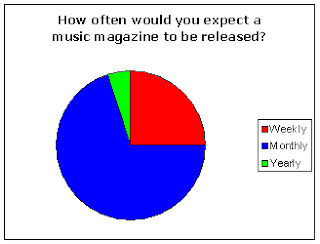
This research graph shows that the majority of my target audience expect a music magazine to be released monthly. However, as I have already found out through my research my target audience would only buy a music magazine once every 2 months so although they expect a music magazine to be released monthly, most of them would only buy it roughly once every two months so I will release mine once every two months. This means that the amount of people buying every issue will increase as appose to if it was released monthly, and when the magazine is released it becomes more important to the magazines followers because it is only released 6 times a year. This would also give the magazine a fresher feel and would make it more of an event when it was actually released.

Questionnaire Analysis 7

This research graph shows that the majority of my target audience would be willing to pay between £1.01 and £3 for a music magazine. Therefore this is the price range that my magazine will fall into depending on how much I feel I could actually charge if the magazine was on sale to the general public. If I charged anymore or any less then I would be eliminating an enormous percentage of my target audience who wouldn’t buy the magazine if the price was more or less than already stated.

Questionnaire Analysis 6

This research graph shows that my target audience would prefer and image dominated double-page spread as appose to a blocky styled or text dominated one. Therefore my double-page spread will be image dominated with a small proportion of it dominated by text because after all it is an article and a quarter of my target audience do want a text dominated double-page spread to begin with.

Questionnaire Analysis 5

This research graph shows that more of my target audience want an article promoting contents page as appose to an image dominated one. Therefore I will make my contents page have a mostly article promoting style with images used to promote some of the articles. This will also maximise profitable and buyers because my target audience is being given what they want in a contents page.

Questionnaire Analysis 4

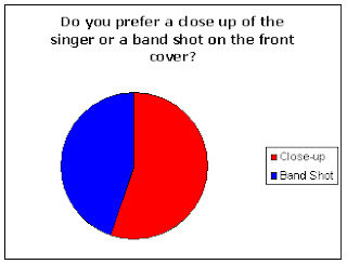
This research graph shows that more of my target audience want a close up of the singer on the front cover as appose to a medium shot of the band. Therefore I am going to follow this research and put a close up of the lead singer on my front cover. This is simply following the demand of my target audience to maximise profitability and increase sales revenue.

Questionnaire Analysis 3

When I carried out my research the results for this question were possibly the hardest to analyse. The question was ‘What would put you off buying a music magazine?’ Many people I asked were unable to answer this question but the answers I did get were particularly interesting. One person I asked said that too many colours and over excessive fonts would put them off buying a music magazine. Therefore I will definitely take this into account when creating my magazine. Another answer I got was unattractive main image. Therefore as before I will definitely take this into account when taking my pictures and editing the cover of my music magazine.

Questionnaire Analysis 2

When I carried out my research this question gave me some very interesting results. The question i asked was 'What is your favourite music magazine?' Nine people out of twenty told me that their favourite music magazine was Kerrang. Five People told me that their favourite was NME and three people said their favourite was Q. This tells me that my target audience wants a mostly Kerrang based magazine with a slight NME and Q vibe to it. Therefore, this will be what I base my magazine on and what the finished product will look like. The rest of the people I asked said other less well known magazines so I won’t take these outliers into account when creating my magazine.

Questionnaire Analysis 1

This research graph shows that the majority of my target audience buys music magazines 0-10 times per year. This tells me that to make my magazine particularly successful I would have to release it between 0 and 10 times a year. Now that I know this I have decided that I would release my magazine once every two months. This would keep most of the readers happy and would maximise the amount of readers who buy every issue of the magazine. This may not maximise profitability but it would keep a steady and stable following.

Thursday, 17 March 2011

Questionnaire


  1. How often do you buy music magazines (per year)?
            0-4 times
5-10 times
11+

  1. What is your favourite music magazine?
…………………………………………………

  1. What would put you off buying a music magazine?
………………………………………………………………..
………………………………………………………………..
………………………………………………………………..


  1. Do you prefer a close up of the singer or a band shot on the front cover?
Close-up
Band shot

  1. Do you prefer an image dominated contents page or one that concentrates on promoting the articles?
Image dominated
Article promoting

  1. What layout would you prefer your double page spread to be like?
Image dominated
Blocky
Text dominated

  1. How much would you be willing to pay for a music magazine? (£)
0-1
1.01-2
2.01-3
3+

  1. How often would u expect a music magazine to be released?
           Weekly
     Monthly
     Yearly

  1. Would free posters/CD’s make you want to buy a music magazine?
Yes
            No

10.  What is your favourite genre of music?
            …………………………………………………………….

Wednesday, 9 March 2011

Dairy Entry: Week 1

On week 1 I completed my analysis of 5 front covers, contents pages and double-page spreads. I looked at two NME magazines and three Kerrang magazines eventually deciding on basing my magazine on the style of Kerrang with a slight NME influence. I made this decision whilst carrying out my analysis. I found this analysis hard but interesting and learnt a lot about the codes and conventions that I need to follow to make my magazine look professional and to make it suit the genre that I am aiming for. This week I also completed my initial ideas which showed me that there was more to think about than I had first thought. It showed me that every detail needs to be carefully considered to make the magazine look like an actual magazine. I also realised that the colour scheme had to be thought about and that once all my ideas were on paper, it was easier to decide on what direction to go in regarding even the minor details.

Double-Page Spread Analysis

This double-page spread follows one basic style model of an NME double-page spread. One page is image dominated and not at all blocky. This image then stretches slightly onto the other page. The other page has an eye-catching title of the bands name to highlight who they are and catch the reader’s attention. This means that the reader doesn’t have to look very far to find out who the article is actually about. The article itself it split up into two columns. I think when I create my double-page spread I will probably separate my article into three columns instead of two. The background is mostly bare as not to distract attention from the band itself with the occasional splat of paint behind the band possibly as a play on words from the actual name of the band which is called ‘the art breakers’. The pose of the band members shows them as wild and unpredictable. I will definitely think extremely hard about the pose and positioning of the band members in my double-page spread.

Double-Page Spread Analysis

This double-page spread follows one basic style model of a double-page spread used in NME magazine. One page is image dominated and not at all in the ‘blocky’ format. The other page has an eye-catching and interesting quote stamped across it in big letters which overlaps slightly on to the left page. There is a paragraph of information under this quote and underneath this the article separated into two paragraphs. I don’t think I will use the two paragraph system as I have been often told to follow the ‘rule of thirds’ to make an article or double-page spread more attractive to the eye of the reader. The background is bare and plain as not to distract attention from the article or main image. This is a technique that I will definitely use when creating my magazine as it may prove to be important for making the magazine article look professional. The positioning and pose of the men shows a lot about what image they are trying to portray. They each have a relaxed and possibly playful pose and they are stood together in unity. Pose is obviously very important when deciding what image to portray of a band and this is something I will have to think very clearly about.

Double-Page Spread Analysis

This double-page spread has a style model that I don’t think I will take much inspiration from although it is quite affective and pleasing to the eye. The main image on this article is centralised with the two columns of texts either side of it. The main image of Alexi Laiho is dark and has almost been drained of colour. This could be to show how low and depressed he felt when dealing with his years of drug problems. The rest of the band are pictured in the top left in a slightly lighter colour scheme. This may also be to show the genre of the band. The quote ‘I was killing myself’ is in the same colour text as the title. This means it is eye-catching and obviously something the editor thought was important. This double-page spread is both in the blocky and image dominated style, something I definitely will not do. My double-page spread will be image dominated with columns of text and other quotes and images carefully placed. The placement of Alexi in the main image also shows his quiet internal desperation proving once more how important pose and positioning is and how affectively it can be used.

Double-Page Spread Analysis

This double-page spread has all the conventions of the average Kerrang double-page spread. This one however takes image dominated to the next level. The whole of the two pages is one huge image. The text is then pressed against a part of the image which doesn’t need to be shown. The image is dark and not the best quality possibly to show that this article is looking back sixteen years to when the band had first started, as appose to it being recent. The caption ‘I’ll stick around.’ is in a big eye-catching text and is a pasty yellow colour so it matches the image and doesn’t distract full attention from it. The text on this article is in the top right hand corner, a placement that I will not be using when designing my double-page spread. My text will be on the left or possibly along the bottom, not in the top right. The brownish look of the whole article is to make it look old, showing that it is a ‘Classic K!’ article.

Double-Page Spread Analysis

This double-page spread has a style model that would be quite easy to replicate. It follows many codes and conventions of an average Kerrang double-page spread but there are so many different styles of double-page spread in Kerrang that it is hard to generalise. This article is definitely image dominated. The image covers most of the two pages leaving room on the right hand side for the article itself. The quote ‘I don’t miss Paramore one bit!’ is in huge big eye-catching letters. This is because this is quite a shocking revelation to be made by the former band member. The writing is split up into two columns and the questions asked are in bigger and clearly letters than the actual answers. This is so that the reader if they are just skimming the article would be able to find the questions they wanted to know the answers to with ease. The text beside the quote explains the quote and tells people about the actual article. That is why it is slightly smaller than the actual quote. The picture in the top right hand corner is off Josh Farro’s former band Paramore. This image is slightly askew possibly to show that this band has had problems and split up.
The main image shows the band members almost coming out of the trees or possibly through them. This may show that the band has just immerged ‘through the trees.’ They have came out of the wilderness and are here to stay. This deep symbolism represents the persona that the band is trying to be associated with. In my magazine I will definitely use the heavily image dominated and not at all blocky style in my double-page spread. I will also concentrate intently on the position and pose of the band members.

Contents Page Analysis

This contents page follows the majority of codes and conventions that the average NME contents page does. It has a white background which is clearly visible as the pictures and text do not take up the whole page. It has one central image that is larger than the others, possibly highlighting this article for its important or how reader friendly the article may be. The style of this contents page is artistically simple. The articles the editor thinks the reader will be more interested in are bigger than the less appealing ones. The title and page numbers are in a very clear font avoiding confusion and making it more reader friendly. The extra articles shown in the ‘plus’ section are big enough to be eye-catching and bare some importance, but does not take focus away from the main featured articles. If my magazine was going to be done in the style model of NME I would use this bare background, the large clear writing and the same or a similar placement of images to get a similar effect.

Contents Page Analysis

This contents page follows the usual codes and conventions of a NME contents page. It is predominantly white with pictures relating to articles and information about these articles dotted around. There is one central image to catch the reader’s attention. This may be attached to an article that the editor thought would be particularly popular. Most of the images in the contents page are colourful images with the focus in the person in the centre of it. The numbers are big black numbers with a white background so they are easy to read and are easily spotted. The title ‘Inside this week’ is also in big black letters with a white background. This is simplistic but it does make the purpose of the page clear. If I was to do an NME styled magazine I would have to follow many conventions and traits of this contents page as it is in the same style as an average NME contents page.

Contents Page Analysis

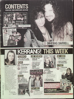
This contents page has a very similar layout to the average Kerrang contents page. The traditional title ‘contents’ appears as yellow writing on a black background. This will definitely appear in my magazine contents page. As always a quote appears under the title to interest and possibly intrigue the reader. The pages listed under the title ‘this week’ are down the right hand side and subcategorised by titles in the traditional yellow writing and black background. The main featured image is in the top left and is the biggest image on the page making it the most eye-catching. This is the article the editor believes will be the most popular and therefore is made the easiest to read. The rest of the featured article images are the same size and set out in an orderly fashion. I will use this style model when creating my magazine contents page. The numbers are set out in the yellow writing and black background showing that this is a running colour scheme throughout the page. The bare white background is also an attribute that I will be following. The note from the editor in the top left would also be a convention that I will follow.

Contents Page Analysis

This Kerrang contents page has the basic outline of the majority of Kerrang contents pages. The title ‘Contents’ is in the top right hand corner in yellow writing with a black background. The issue number and date is also stated here in a smaller less eye-catching font. There is one main image of an article that the editor would expect many of the readers to want to read. Therefore this image representing this article is given a large proportion of the page. The section labelled as ‘This week’ is down the right hand side and is well proportioned in relation to the featured article on this page. Each section of this is labelled clearly with again yellow writing on a black background. The pages and names of the articles are then under these subcategories. The note from the editor is in the top left of the page when previously it has sometimes appeared in the bottom left. I will do this in my contents page. The images of the articles are edited in the style of the ‘rule of thirds’ across the page. They are also laid out in an orderly style with every image except from the main featured one, the same size. I will possibly use this type of layout in my magazine.

Contents Page Analysis

This contents page has many of the qualities and conventions demonstrated by most Kerrang contents pages. The main article that the editor feels would appeal to the most to readers is given a full half a page. The background of the rest of the contents is predominantly white. This makes the black and yellow writing stand out more and makes the page more attractive to the eye. The title ‘Contents’ is in big clear letters and is in a light colour making it stand out from the black background it is pinned against. As well as this title the banner stating ‘Kerrang! This week’ is used to headline the rest of the magazine and what is contains. The word ‘Kerrang’ is in white letters as appose to the words ‘This week’ which are in yellow. This is so that the title of the magazine stands out more than the works ‘this week’ against the black banner background. There is a slight editors section which I may or may not put in my contents page. The sections of the magazine are clear shown by the big yellow writing and the black background to make them stand out. The pictures are placed very specifically with some even coming out of their frame. The page numbers and article names have a bigger font than the additional information so that the reader can choose to read the additional information if he or she wanted to. This means the reader doesn’t have to look far to find the article names.

Monday, 7 March 2011

Front Cover Analysis

Lighting is used in this cover to over highlight the obscurity and intensiveness of the central image. This band member has no shirt on and his costume mainly consists of jeans, a heart and a bullet wound to the head. This gives a totally insane look along with his facial expression. The purpose of this is to make him look madly insane and possibly to show that they are more ‘hardcore’ than the majority of other bands. This is why his eyes have been edited to look more devilish and menacing. Also, the captions add to this persona. The words ‘Fucked up, the beating heart of the underground’ shows the madness of the band and it also adds to the obscurity. As well as all this, the caption ‘Our shows are orgies of destruction’ shows how the band would like to be represented, and the caption is broken up in almost a destructive way.
The fact that the band this person is from is not shown is interesting. It means that the editor has such faith in the image that he believes he doesn’t need to put the band name or anything else that appears in the magazine. This is because the editor knows that people who recognise this man will want to read about him and possibly the band, but people who don’t recognise him will want to know more and what band his is from because of the obscurity and madness of the image.
The setting of this image shows this madness even more magnified. Aside from the fact that he has a bullet wound to the head and a heart in his hand, all this has taken place in a regular supermarket a traditionally safe and normal place.

Front Cover Analysis

Lighting and costume is used extremely effectively in this magazine cover. Firstly he is wearing no clothing. This shows him as a simplistic innocent character. This could possibly show in this interview he has been stripped of his shell and defensive barriers, and the real him may be shining through. This effect would definitely appeal to the readers who want to know more about the ‘real’ Pete Doherty. This is further enhanced with the fact that the imperfections on his face have not been removed. This definitely adds to the effect of him being the real Pete Doherty in this interview. This is also the case with the caption beside him that says ‘In the raw.’
The rest of the cover is positioned around the central image. Other information about the magazine is positioned around him so that his bare chest can be seen. The title is also almost sidelined by the image showing the importance of him in respect to the actual magazine. This may show that the editors think they can sell more magazines with the image of Pete Doherty as appose to their actual logo.
The ‘new music’ section of the cover may be to attract readers who are sick of hearing about the same old people, for example Pete Doherty.
The colour scheme of the cover is mainly pinks and purples contrasted with whites and blacks. This works quite effectively especially as Pete Doherty’s skin colour is a very bright colour that contrasts to the purple background and pink writing.

Front Cover Analysis

The lighting on this cover is very interesting. The members of the band are very well lit, apart from curtain specific areas of their faces. However, the lead singers face has more shadowing than the faces of the other two members. This, along with his tattoos and hood show him as the more dangerous or possibly mysterious member of the band. His white hood highlights the dark areas of his face magnifying this effect. The purpose of this is to obviously highlight the lead singer of the band, this is also done with him being positioned closer to the camera and being over the title of the magazine, whereas the other members of the band and positioned behind it. This shows the difference in importance of the different band members.
The strap line banner simply says ‘massive download ticket give away.’ This would encourage people to buy the magazine if they think there is a chance of winning a download festival ticket or tickets.
The bottom strap line and free poster special giveaways are well proportioned and also well positioned. They are eye-catching enough to draw the attention of the reader, but they do not take over the whole of the cover.
Also, the Paramore part of the cover is positioned in a way that will also catch the reader’s attention, and the caption ‘Hayley starts a riot,’ is a play on words from the bands style as they are heavily associated with the word ‘riot.’

Front Cover Analysis

Dark theme shows the gothic style of the band. Very clear title of the bands name, this catches the readers attention and also tells people who are not familiar with the band, who they are.
Title of the magazine as always put to the back almost in arrogance of not having to make it perfectly clear.
The singer of the band is obviously bigger and stands out more as he will be the most well known and almost a symbol of the band. Therefore, he is closer to the camera than the rest of the band. He is also slightly tilted with a mad smile to make him look more unstable and fanatical. The tour they are promoting is also pressed beside the bands title and slightly overlaps it. This immediately tells the reader where they can see the band and also shows what tour the band is promoting.
The poster offer is well proportioned as it is big enough to be eye catching, but does not take over the cover completely.
Facial expression of Jimmy Urine (far left) along with the caption ‘be afraid Britain, be very afraid!’ gives the band a mad like quality, something they obviously encourage judging by the bands usual persona displayed here.
Good layout, pose of the band members shows the mood as slightly insane and possibly dangerous which corresponds with the quote ‘be afraid Britain, be very afraid.’
Strap line banner shows mostly dark bands that are mostly similar to mindless self indulgence, again showing the genre Kerrang is usually associated with.

Front Cover Analysis

Lighting and costume are used to make the band look like smart ‘scene kids’. Not dissimilar to the 60’s movement known as the ‘MOD’s.’ The Kerrang title backgrounded like usual, shows again the arrogance of the magazine that they don’t need to be clear about their title as they are so well known. Dark colours are used mixed with whites and reds, white because it is the most eye-catching as it is completely opposite to black, and red represents blood, something a ‘screamo’ band is often associated with. The camera angles and positioning of the band members is interesting. The lead singer is at the front and is the most noticeable and eye-catching as he is the most famous member of the band. The rest of the band members are positioned almost in order of importance and the least known members are further away from the camera.
The way Oli Sykes is positioned shows how hardcore he is showing off his tattoos. This is also used as part of the bands persona as he looks almost like a superhero with his tattoos being just visible under his shirt.
The title of the band is in big bold letters to catch the reader’s attention. The other bands on the cover are similar to bring me the horizon as are the bands featured on the strap line banner. This shows the type of music generally covered by Kerrang magazine.

Initial Ideas

As this wouldn’t photocopy particularly clearly, I have labelled the less clear parts of the spider diagram.